Advent Online Learning
The research and design process behind updating a look.
Advent Online Learning is an online course platform for people who committed minor crimes and infractions. It's targeted at first offenders to help them break the cycle of unlawful behavior.
The Spec
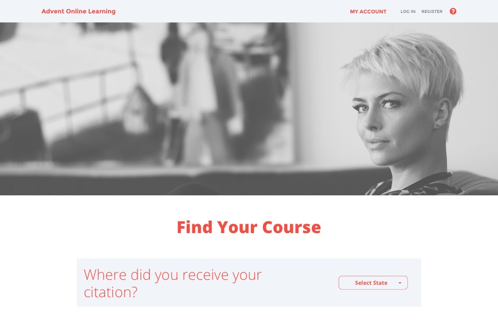
The client's goals were straightforward. They were working off an old, utilitarian design that had been built to release the content as quickly as possible, not with the users in mind. They wanted a cleaner, modern upgrade. They only had two requests regarding design. One, that we maintain the existing brand colors. Two, that we introduce full-width cover photos at the top of most pages. Beyond that, we were only constrained by the requirement to reskin the current site without restructuring the content.
User Research
| Any cellphone | Smartphone | Cellphone, but not smartphone | |
|---|---|---|---|
| Urban | 95% | 77% | 17% |
| Suburban | 96% | 79% | 16% |
| Rural | 94% | 67% | 27% |
|
|
|||
What I did know from Advent's user research was that visitors to the site were often confused and had trouble navigating. Considering the low smartphone ownership rates of rural areas, and the correlation between smartphone ownership and technological literacy, this was unsurprising. After collecting this data, I was certain that a simple, clear site flow was paramount to the usability of my redesign.
Site Flow
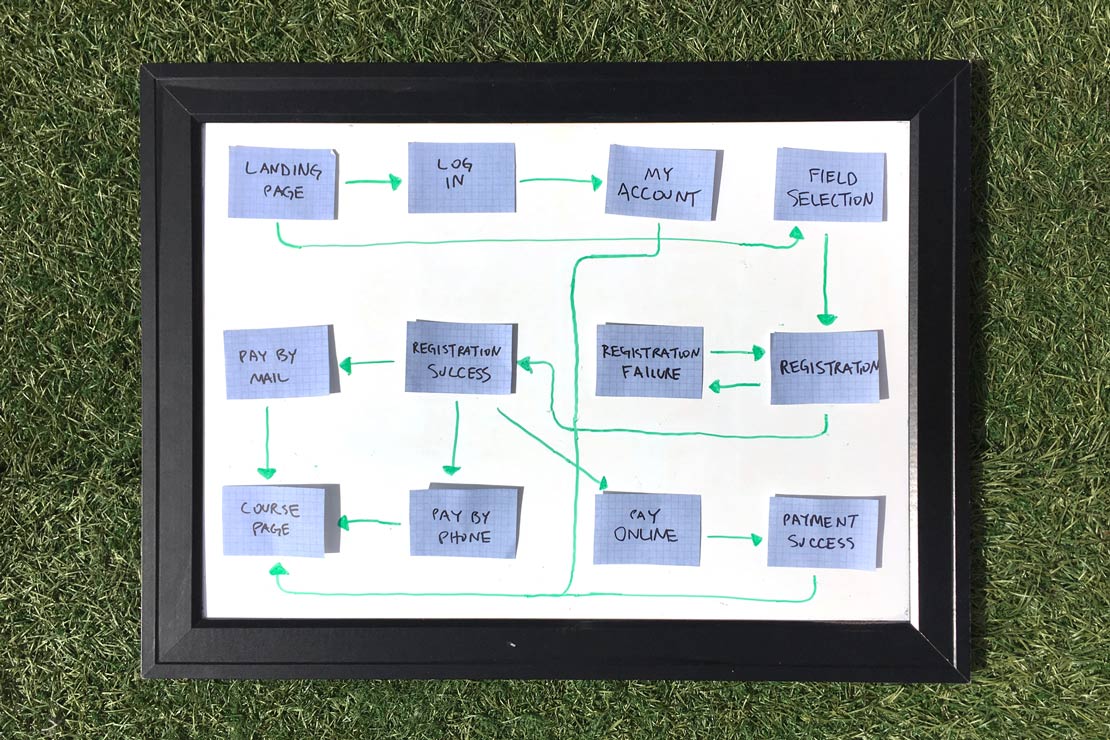
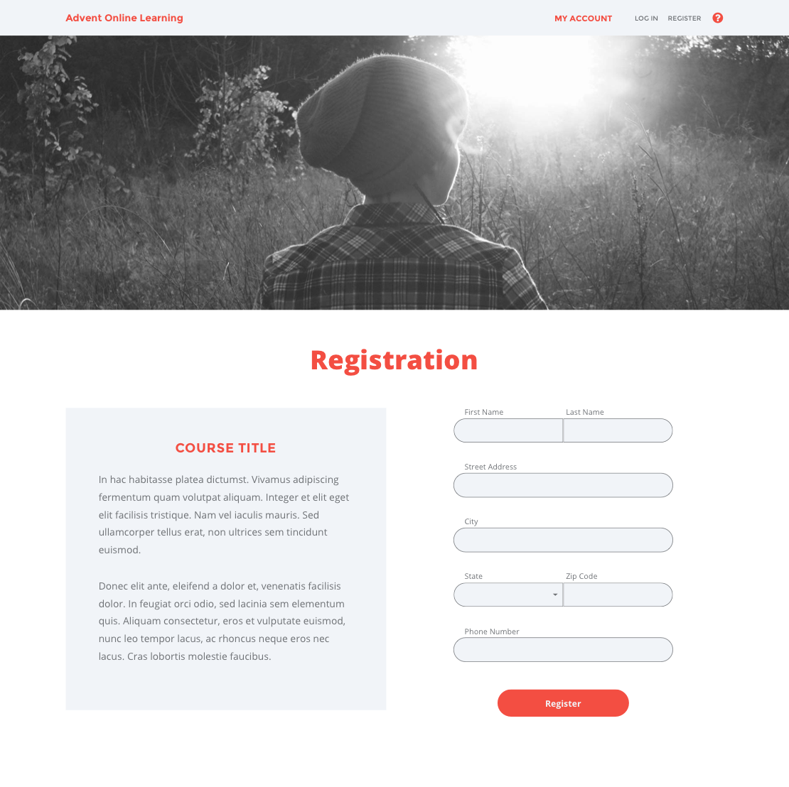
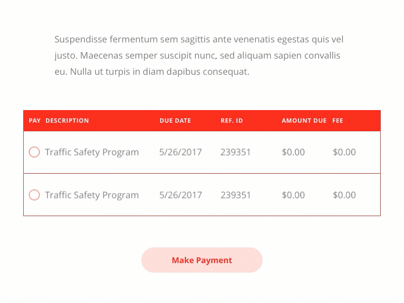
To update the site flow, I began by focusing on user objectives. The site has two users: course students and course assignees. The assignees have it a bit easier, as all the have to do is log in to their account, and all their tools are in their account dashboard. (According to the client, there didn't need to be a user-facing registration for course assignees.)
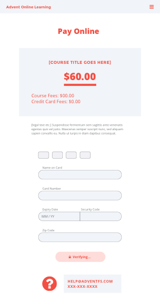
For course students, the process was more involved. To complete the course, they had to register, take the course, and pay for the course. Payment could be made at any time and through three different payment methods (online, by mail, or by phone). The order of operations here was confusing to people, because normally you can't access materials until you pay for them, but that's not the case here. I chose to make the process imitate a standard payment gateway as much as possible, going from registration to payment to the course. But to allow students to get to the materials right away, I directed students straight to the course page after instructing them how to pay. This has some clear benefits:
- the process is explained upfront
- everyone gets immediate access to the materials
- but the users don't have to hunt around the site to find the payment options: it's presented and explained immediately, and easily accessible from the account dashboard at any time
Atomic Design
I've made some updates to my typical workflow since, but at the time I followed atomic design principles in all my projects. I like to start out by mapping out all the building blocks that go in to a screen (also known as "molecules" in the language of atomic design). For more complex projects, I start at a higher level and consider all the required page templates first. That wasn't necessary for this project as all the pages follow the same template.
After creating the site flow and thinking up a few ideas on structuring the content for usability, I came up with a complete list of building blocks.
- Menu bar
- Dialogue
- Log in
- Success/failure
- Help
- Hero
- Full screen w/content
- Image-only
- Page title
- Form
- Menu
- Body content
- Emphasized
- Normal
- De-emphasized
- Dropdown
- Multiple selector
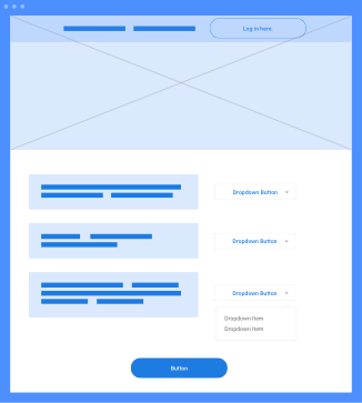
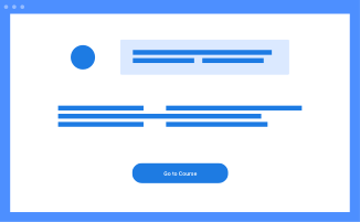
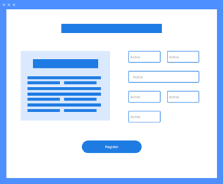
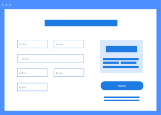
Wireframing
With a site flow and building blocks in place, the wireframing process becomes very intuitive. My priorities are ease of use for the user and displaying an appropriate hierarchy of information. With this in mind I mock up a mobile layout first, and then a desktop layout.
Design Decisions
With the practical building blocks in place, my thought process shifts as I move further into the visual design phase. I keep these questions front-of-mind:
- What's the objective of this screen or section, big picture-wise?
- What are users looking for, and how are they using the screen based on their different goals?
- How does my visual design reflect their intentions and their needs?
When I get lost in some nitpicky design detail or code snippet – happens to the best of us – these points bring me back to focus on the big picture. They also help a great deal when it comes time to share the design with the client. This way I can justify every design decision I've made with evidence, not merely because I think it looks good. Objective trumps subjective every time.
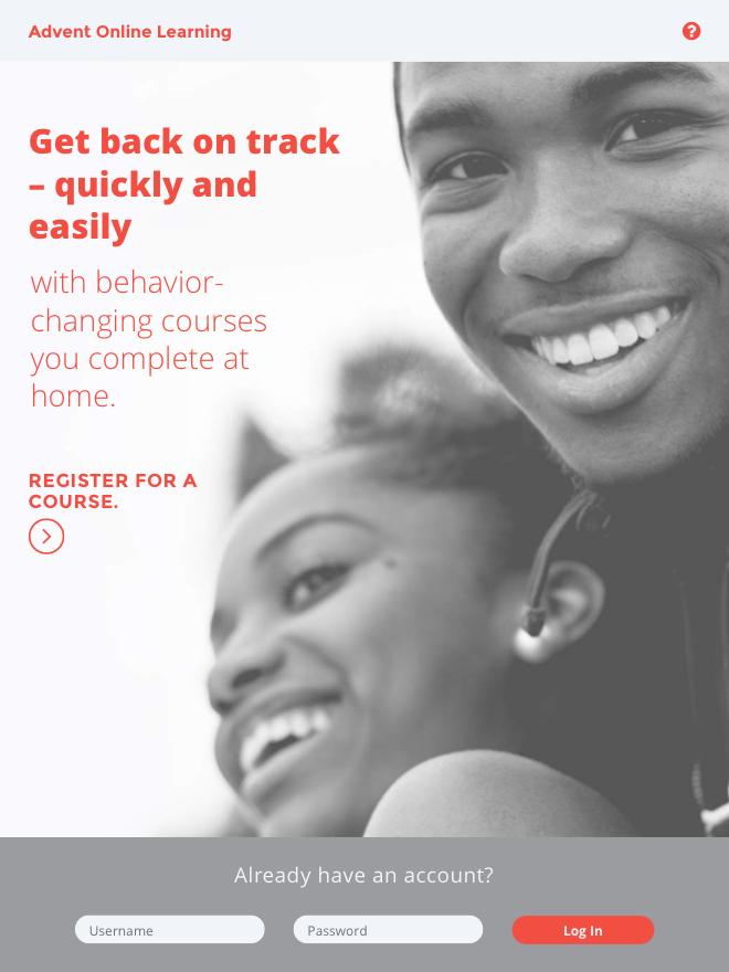
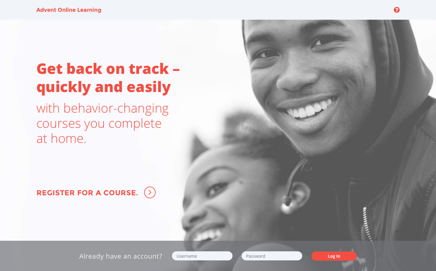
An example of this was my process for selecting the hero images. Sourcing photos was left up to me, so I used it as an opportunity to inject some warmth and humanity into what was otherwise a very minimal app.
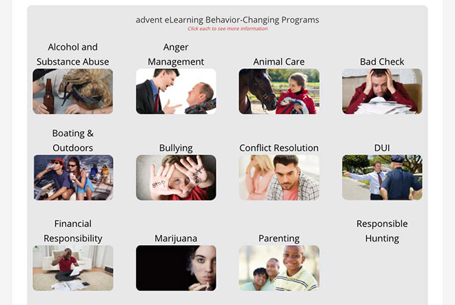
The original images showed people engaged in the behavior the course was designed to change. For example, "Alcohol and Substance Abuse" portrayed a drunk woman collapsed on a table. "Traffic Safety" showed a raging man behind the wheel. This struck me as a missed opportunity to convey a more uplifting message, one that tied in with the program's aims. I picked out a few stock portraits that stood out to me as more raw and honest than most. They give the impression the subject has been through hard times, but has come out strong on the other end. Course attendees are going through a challenging time in their lives. The new photos subtly make it a more positive experience to use the app.
Handoff
I had some concerns about the upcoming design handoff. The developer wanted the designs in an unusual format – I knew we'd lose some details if I couldn't deliver via Zeplin or a similar tool. In the end I sent the designs to the developer in the format he requested, along with a range of supplemental files. I included the following in the handoff:
- an annotated PDF with notes (normally I would use InVision to make an interactive prototype with comments)
- a graphic overlaying the design with the grid system I used with some comments on spacing and measurement
- a cache of additional hero images for the client to use on pages they may create later
- SVG versions of all the icons
- interactions made in Principle for the menu, forms, and some other bits and pieces
- a comprehensive style guide with both PDF and CSS versions, built in Zeplin
It was clear to me that we would lose some design details and interactions if I didn't include supplemental information in the handoff. This went beyond what the developer requested from the project manager. But it was important to me to include the necessary info to match the code and design as close as possible. So I included a suite of supplementary files, and ensured all was in order in the file format he requested.
Takeaways