Riskopy
Founding a startup.
In 2016, I cofounded a fintech startup called Riskopy. We built a machine learning engine for finance providers. It aggregated and contextualized data on 100 million businesses, helping our customers monitor their clients’ portfolios for risks and opportunities.
I was the Chief Product Officer and in charge of all things design. When I came on board, the product was a single-page Bootstrap template. In under a year, my cofounders and I grew it into a contextual search tool, company dashboard screens, and a list feature for tracking company data over time.
Before long, we'd built out a product offering unique and valuable enough that we were acquired by Coupa in 2017. I learned a lot along the way.
From a product perspective, I think our most interesting achievement was our portfolio monitoring product, and how we built it from a bit of an afterthought into our bread and butter.
Throwing (design) principles out the window
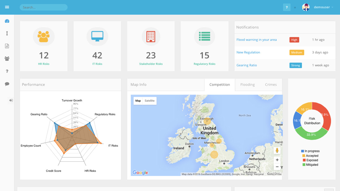
On day one at Riskopy, my cofounder entrusted me with a list of key data points and a Bootstrap template folder. My first task was to design a dashboard for our original product. It curated data to deliver risk assessments based on dynamic data on a range of factors. It then leveraged that data to supplement business credit reports for finance providers.
We didn't have any customers or user research yet. All we had was a long list of meetings with potential customers queued up. And all we needed was a screen to show them.
I'll admit, I designed it in the most quick and dirty way possible. The template had no UI kit to work from, so I opened the template files in Chrome and used the inspector to edit each element I wanted to use. I took screenshots and made a composite in Sketch.
Now, this isn't a design process I would normally advocate! But it got the job done very fast, which was our sole priority at the time.
Shortly after, I coded the composite in HTML, CSS, and Javascript and we launched the dashboard with dummy data.
Pivoting to portfolio monitoring
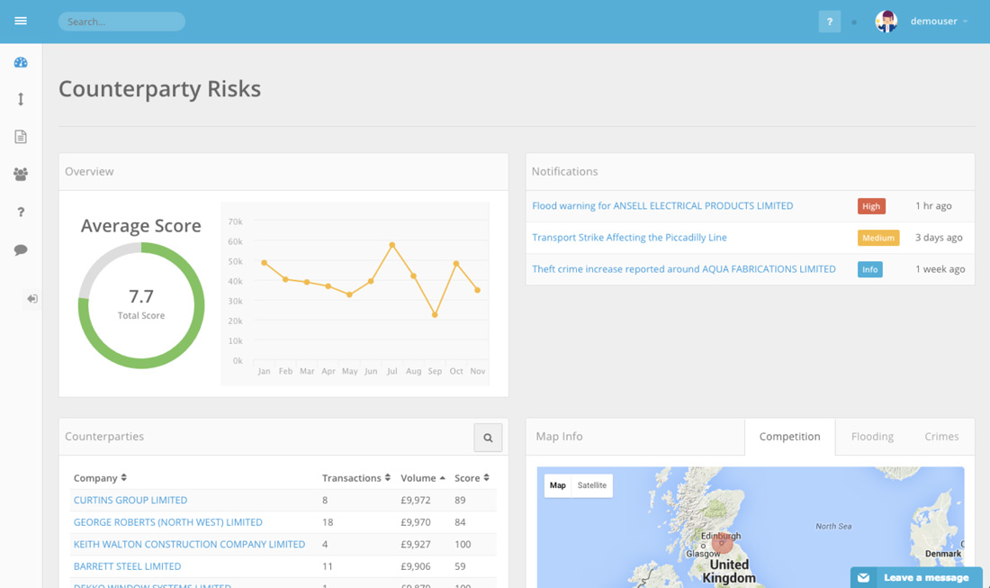
Fast forward a couple months. We're in the swing of it: courting customers, running demos, and taking feedback. We got some pushback on core aspects of our offering. Likewise there was some stronger interest in secondary features. This response led us to focus on portfolio monitoring as our new primary feature.
We made the decision to pivot quickly and gave the dashboard an immediate overhaul. This abrupt transition completely transformed the way we ran our business. We'd been focused on a problem my cofounder had perceived, not on problems customers told us they needed. While Riskopy 1.0 had gained traction, we knew that learning from our users was much more valuable.
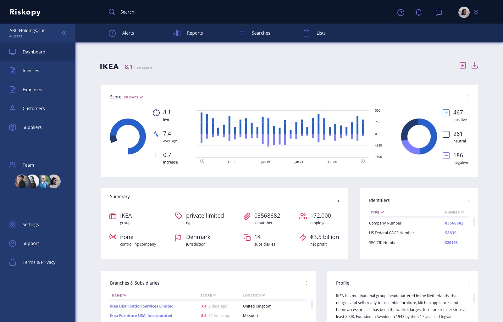
We scrapped the graphs and icons of our cherrypicked data, opting for a utilitarian MVP. The high-priority data went front and center. Customers were interested in portfolio monitoring. At the core of this was the Riskopy score, a ranking system built on our algorithm. Building on the MVP meant building out around this piece of data contextualization.
Product feedback via Jedi mind tricks
By now we were a well-oiled demo machine. And we knew better than ever how to leverage these conversations to our advantage. Since my cofounder was the CEO and had the financial domain experience, he led the demos. I focused on reactions, questions, comments, and reading the room. If the reactions honed in on a particular feature, expressed a pain point, or attention started to fade, I'd interject to steer the demo accordingly. My cofounder would respond to my cues and pick up in the new direction. Sneaky.
As a still-very-eary-stage startup, we faced a lack of customer data but a wealth of potential customers. I knew it wasn't as valuable as feedback from committed (as in, paying) users, but we did our best with what we had.
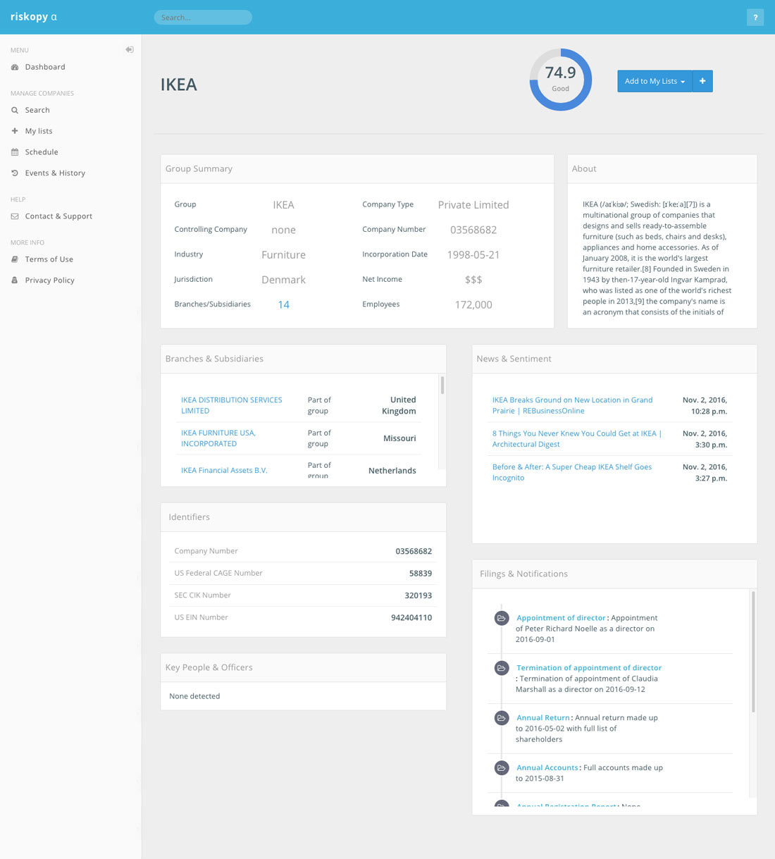
The teams we met were keen to see what data and results came up more so than the analysis we provided – aggregation and curation was winning out over prediction. I continued to organize the dashboard according to the data we could surface and where the feature requests steered us.
Ditching the bare bones look
One thing was becoming painfully clear: we were outgrowing our template. I began creating a new design system behind the scenes while I continued to iterate on the live product. I kept the structure the same, but completely redesigned the rest. Our product was looking to the future, but our design didn't reflect it. We needed a product that was clean, modern, and reflected our branding – not an out-of-the-box utilitarian solution.
I started with Atomic design principles. I broke down our existing components into atoms and molecules, established a tidy design system using Sketch symbols. While I'd been itching for this from the start, it hadn't been practical when using a template and designing in the browser.
To keep up with our weekly Agile sprints, I stuck to my tried and true workflow. Design in Sketch, prototype in InVision, and use Zeplin to help with production code.
As I was building the design system and redesigning screens, talks began to sell the company. Unfortunately, we didn't get to launch the redesign before the sale went through. Now Riskopy lives on as its own product within Coupa, and we're happy with the direction it's taking at its new home.
Takeaways
Perfectionism can cripple an early-stage startup. If I'm being honest, the list of things I'd do differently is endless. There were never enough hours in the day to tackle all my responsibilities to my satisfaction. I know this is the nature of building an early-stage startup with a tiny team. But it's hard to let go of the fantasy of being able to say here's a brilliant thing that I'm 100% proud of and satisfied with.
On the other hand, aesthetics matter, too. In retrospect, I'd be quicker to build our own design system and take on the aesthetic issues. We were working with banks and finance companies – the software they're accustomed to is pretty ugly. So much so that I love your design!
was the first reaction we usually got during demos. So I didn't let it get to me that I was iterating on a minimalist template. Especially since I come from an Agile background, I believe that subtle iterations are best. But it came to a point where I grew complacent with having a product that didn't reflect our brand, and I regret not making the push to take it to the next level sooner than I did.
Design with persistent curiosity. I've learned that being a good designer doesn't mean showing up with all the answers. It means being able to see where the holes are and asking the right questions to fill them in. I think I did this ably. But looking back, I'd push harder in those early days to release a product that I could stand behind – one that's utterly elegant, simple, and joyful to use.